CARMEX REBRAND
Packaging Redesign and a New Narrative
TIMELINE
2 Weeks
SKILLS
Branding
Packaging
Storytelling
ROLE
Graphic Designer
Packaging is oftentimes the first or only interaction between a customer and a brand. It lives at the intersection of strategy, storytelling, and systems thinking. Unlike logos or posters that can exist on their own, packaging must perform from shelves to the internet in competition with other products.
Rebrand and redesign an existing product to clearly communicate and appeal to your desired audience. The new product line must contain at least three varieties (flavors).
1 Challenge


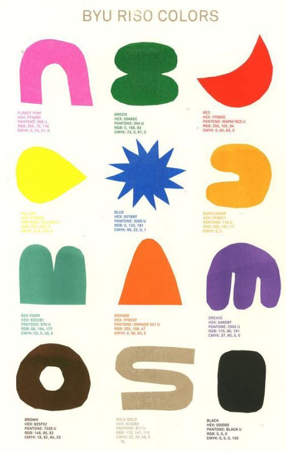
Primary Typeface
Quicksand
Secondary Typeface
Zeitung Micro Pro
2 Ideation
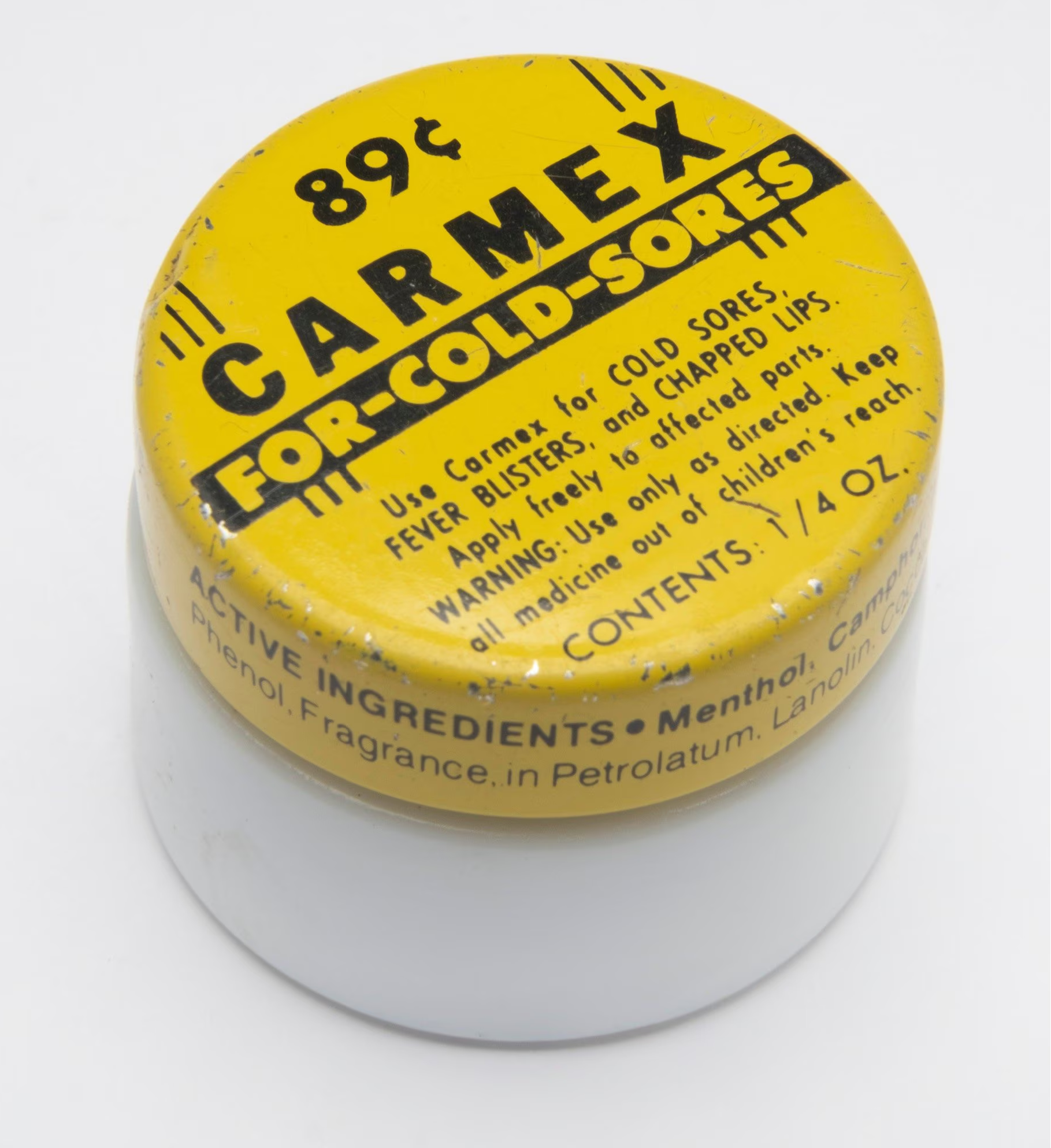
The current design packaging for “Carmex” is very vibrant and bold, but it isn’t visually appealing. Since it is a gender neutral product it should appeal to both men and women, but it has a very masculine image. The current narrative of the product has little reasoning as well.
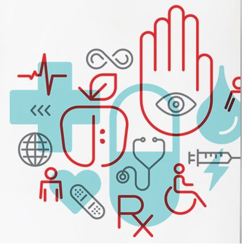
The new design should lean more into the medical narrative, have a gender neutral design, and keep the boldness of color but be visually appealing.

3 Final Product
The final product from this project is a packaging product that leans into a clean, medical design that feels unified, but has distinct variance in the different flavors.
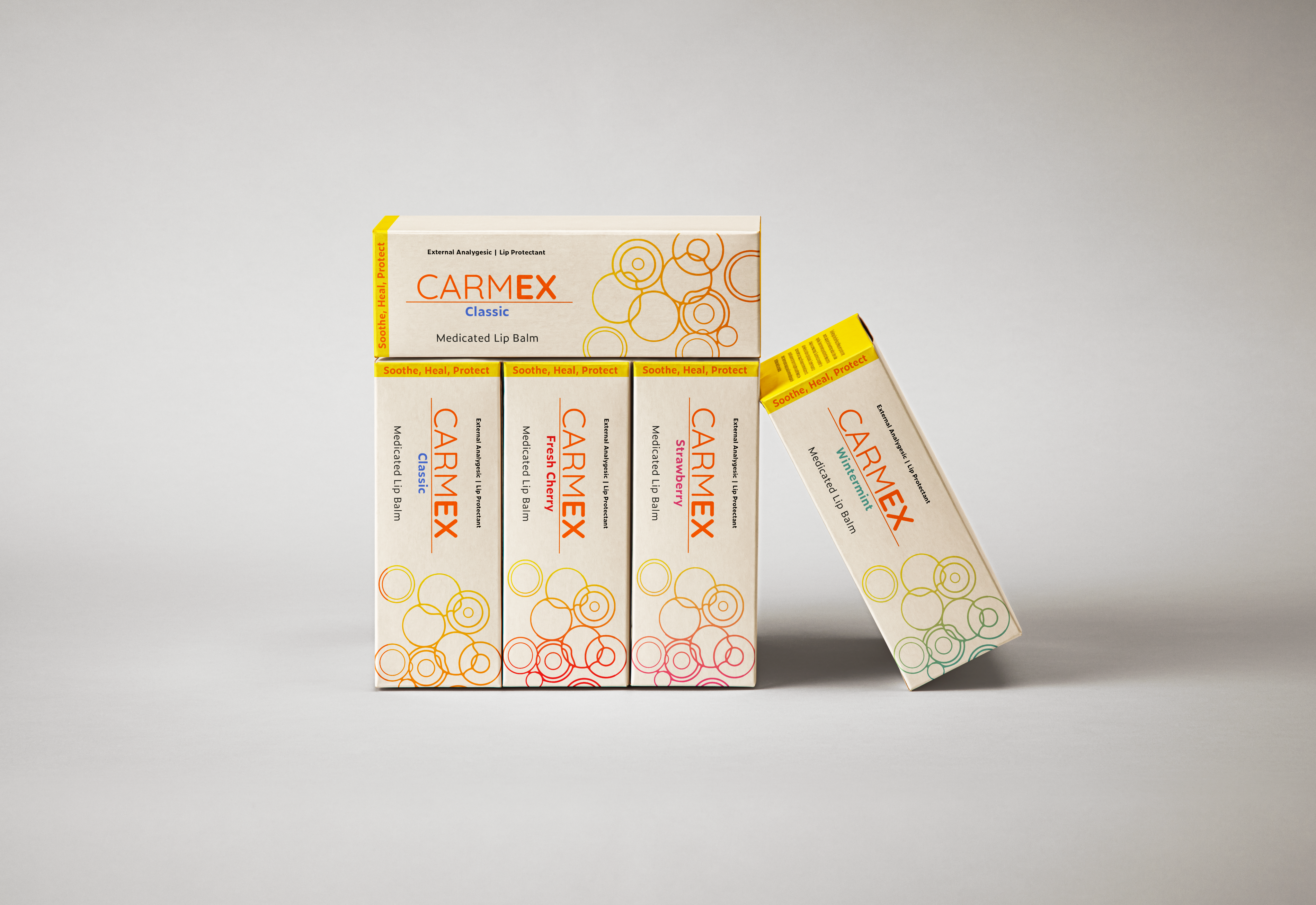
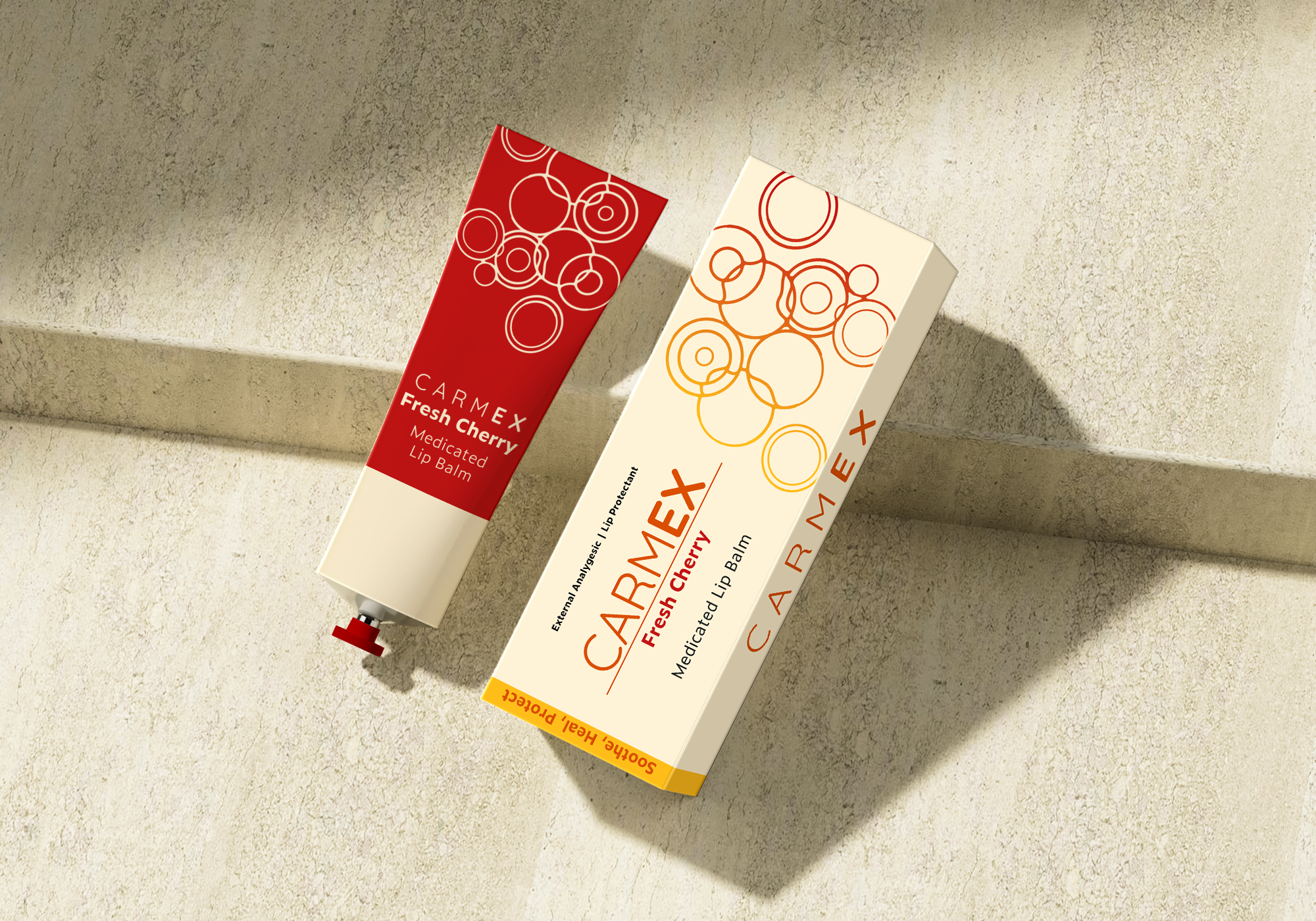
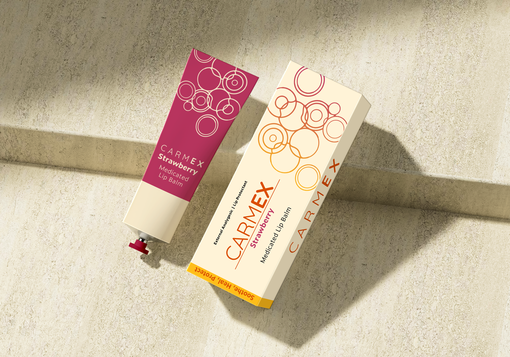
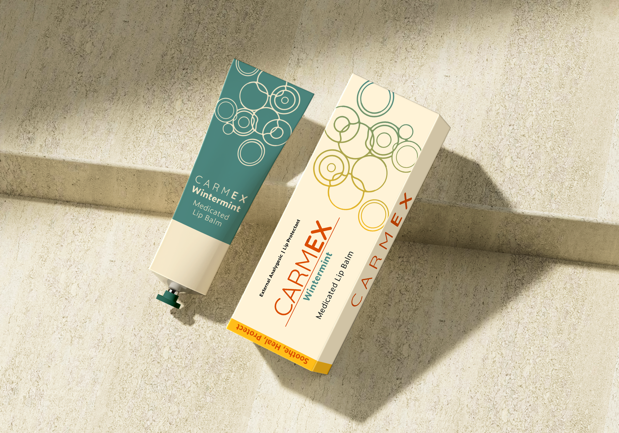
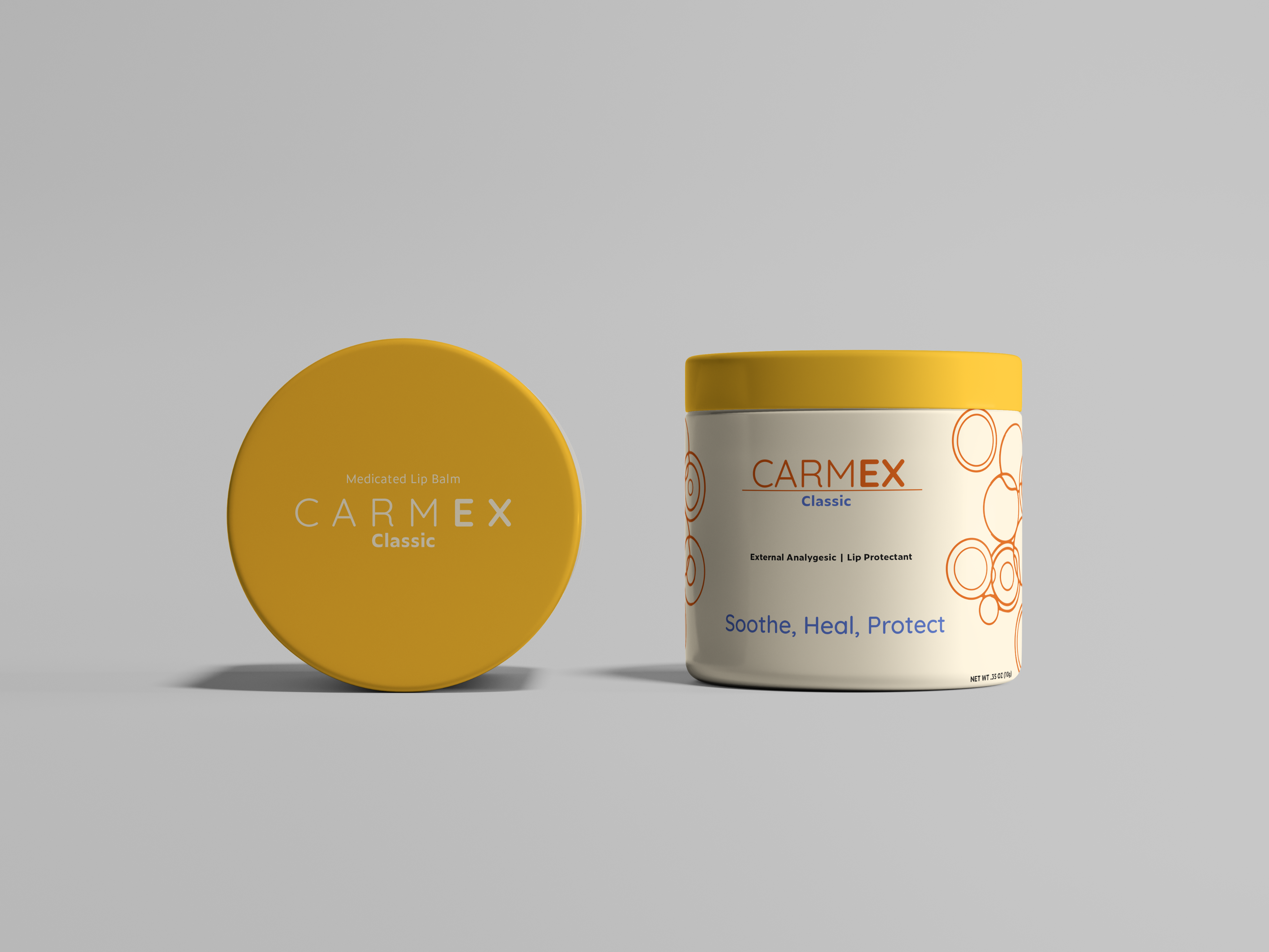


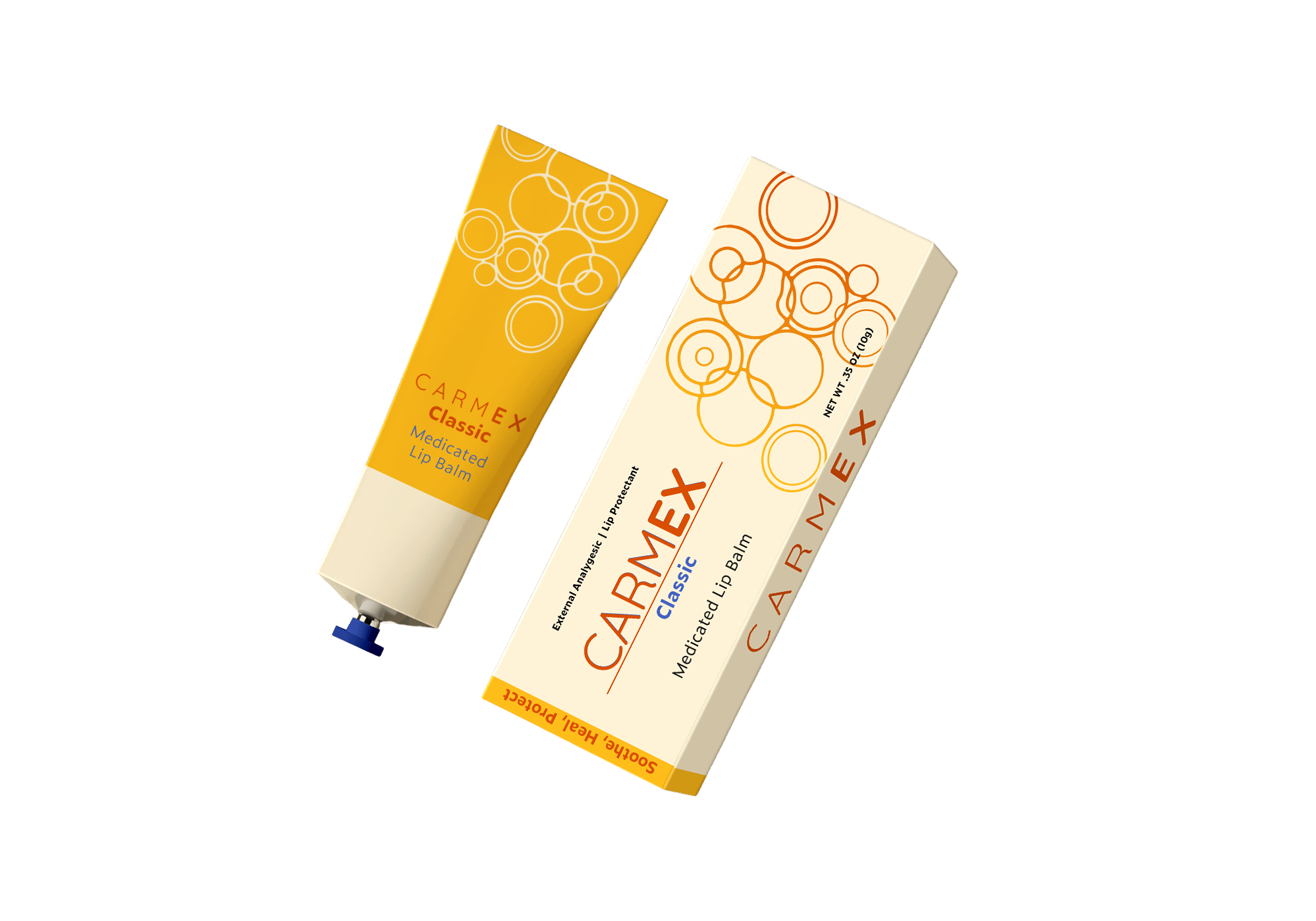
Table of Contents
CARMEX REBRAND
Packaging Redesign and a New Narrative
TIMELINE
2 Weeks
SKILLS
Branding
Packaging
Storytelling
ROLE
Graphic Designer
Packaging is oftentimes the first or only interaction between a customer and a brand. It lives at the intersection of strategy, storytelling, and systems thinking. Unlike logos or posters that can exist on their own, packaging must perform from shelves to the internet in competition with other products.
Rebrand and redesign an existing product to clearly communicate and appeal to your desired audience. The new product line must contain at least three varieties (flavors).
1 Challenge
Primary Typeface
Quicksand
Secondary Typeface
Zeitung Micro Pro
2 Ideation
The current design packaging for “Carmex” is very vibrant and bold, but it isn’t visually appealing. Since it is a gender neutral product it should appeal to both men and women, but it has a very masculine image. The current narrative of the product has little reasoning as well.
The new design should lean more into the medical narrative, have a gender neutral design, and keep the boldness of color but be visually appealing.
3 Final Product
The final product from this project is a packaging product that leans into a clean, medical design that feels unified, but has distinct variance in the different flavors.
Table of Contents